

Help Page
Here are some helpful tips as you manage your site solo!
I am available if any emergencies come up - please feel free to reach out!
NOTES:
Save your section as a backup before editing (look for the heart icon)
Always check the site on mobile after edits too! Editing causes things to shift
ADDING IMAGES
walkthrough video
resize vertical images DOWN to 1200px wide, horizontal images DOWN to 2500px wide
run through https://tinypng.com/
then add to site - walkthrough video
set ALT TEXT on image if needed
asset library video
ADDING TESTIMONIALS
walkthrough
AFTER SITE LAUNCH
GSC errors - don’t panic
POST-LAUNCH SEO CHECKLIST
These are steps you can take to improve your SEO after site launch.
Add your website URL to each of your social media profiles
If you have a business, create a Google Business account and keep it active with posts and responding to reviews
Get backlinks for your website
get listed on your local Chamber of Commerce site or other relevant directories
Keep your site active
add/update your projects regularly
Site-wide CSS and Java Script
FONTS
Headings: Quincy CF Medium
Paragraphs,: Quincy CF Regular
Buttons: Josefin Sans Regular
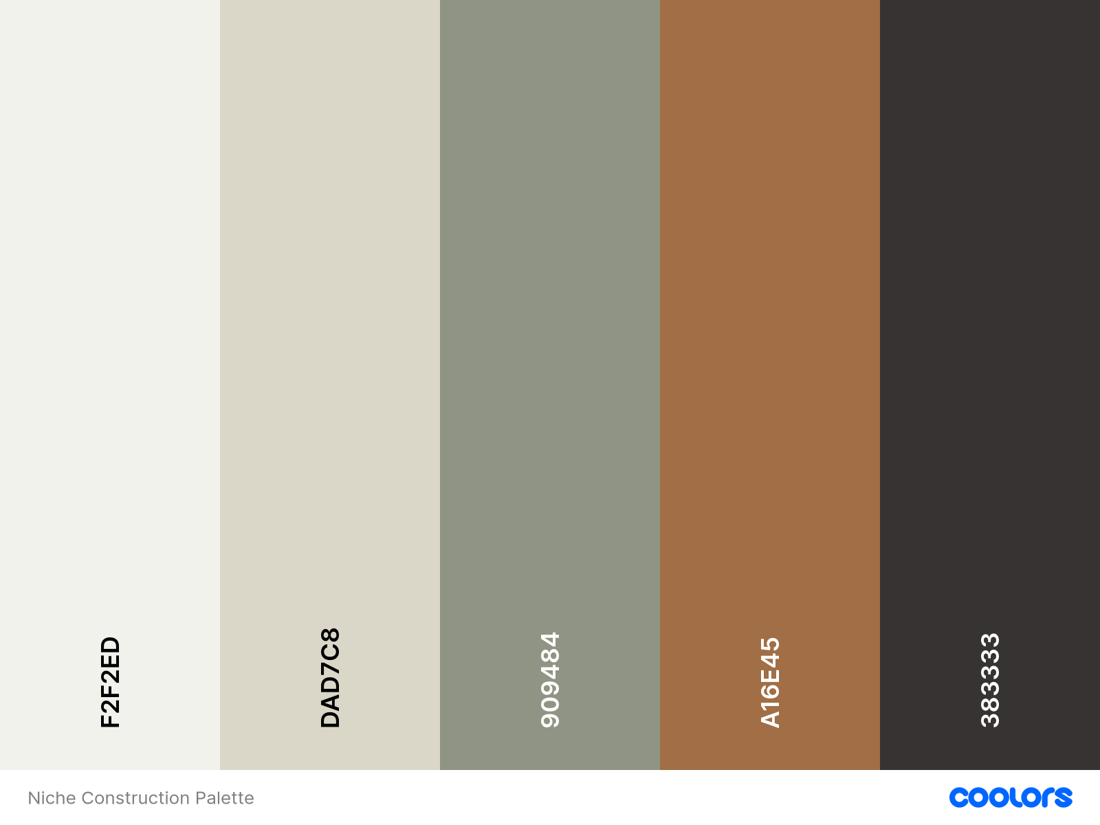
COLORS
view palette & HEX codes
CUSTOM CODE BACKUP
Site-wide CSS
PAGE INJECTION
<link rel="stylesheet" href="https://use.typekit.net/tpk0qay.css">


<!-- Fixed Nav on Scroll - From: Robo-Will -->
<script>
document.addEventListener('DOMContentLoaded', function() {
  const header = document.querySelector('#header');
  const headerTitle = document.querySelector('#header .header-display-desktop .header-title');

  function checkScroll() {
    if (!header || !headerTitle) return;

    // Get the bottom position of the logo
    const titleBottom = headerTitle.getBoundingClientRect().bottom;

    // When logo scrolls out of view, add class
    if (titleBottom <= 0) {
      document.body.classList.add('nav-scrolled');
    } else {
      document.body.classList.remove('nav-scrolled');
    }
  }

  window.addEventListener('scroll', checkScroll);
  checkScroll(); // Run on load
});
</script>
CSS for Home and Services Page (Stacking Feature)
/**
 * Footer Links - Tighter Spacing
 * From: Robo-Will
 **/

/* Target paragraphs in footer HTML blocks */
#footer-sections .sqs-block-html p {
  margin: 4px 0 !important; /* Reduce from 16px to 4px */
}

#footer-sections .sqs-block-html a {
  display: inline-block;
  line-height: 1.3;
}

#footer-sections .sqs-block-html a {
  display: inline-block;
  line-height: 1.3;
  padding: 0; /* Remove padding to prevent overlap */
}

h1, h2, h3, h4, h1 a, h2 a, h3 a, h4 a {
  font-family: quincy-cf, serif;
font-weight: 600;
font-style: normal;
}

.sqsrte-large, p, .sqsrte-small, .sqsrte-large a, p a, .sqsrte-small a {
 font-family: quincy-cf, serif;
font-weight: 400;
font-style: normal;
}

/**
 * Header Tagline Under Logo
 * From: Robo-Will
 **/

/* Add tagline after logo */
#header .header-display-desktop .header-title::after {
  content: "Custom cabinets...and everything else";
  display: block;
  font-size: 1.5em;
  font-weight: 400;
  margin-top: -30px; /* Negative to pull it closer */
  margin-bottom: 40px;
  opacity: 1.0;
  font-family: quincy-cf, serif;
}

/* Hide tagline when nav is fixed (logo scrolled away) */
body.nav-scrolled #header .header-display-desktop .header-title::after {
  display: none;
}

/**
* Header Style - Outline
* From Will-Myers.com
**/
#header {
  --border-width: 1px;
  --border-color: black;
  --nav-resting-bkg: #e8eadc; /* Tan background */
  --nav-resting-text: #383333; /* Dark color from your palette */
  --hover-bkg: #909484; /* Green from your header */
  --hover-text-color: #e8eadc; /* Tan text on green hover */
  --mobile-side-column-width: 80px;

  .header-display-desktop{
    //Layout
    display:grid;
    grid-template-columns: 1fr auto;
    .header-title-nav-wrapper{
      border-color: black;
      display: contents;
    }
    .header-nav{
      grid-column: 1;
      width:100%;
      box-sizing: border-box;
      margin:0;
    }
    .header-title {
      grid-row: 1;
      grid-column: ~'1 / span 2';
      width:100%;
      box-sizing: border-box;
    }
    .header-actions{
      grid-column: 2;
      width:auto;
      border-bottom: var(--border-width) solid;
      border-color: var(--border-color);
      box-sizing: border-box;
    }
    .header-nav *, nav.header-menu-nav-list *

    //Borders
    .header-title {
      border-bottom: var(--border-width) solid;
      border-color: var(--border-color);
    }
    .header-nav-list > .header-nav-item{
      border-right: var(--border-width) solid;
      border-bottom: var(--border-width) solid;
      border-color: var(--border-color);
    }
    .header-nav-list > .header-nav-item:last-child{
      border-right:0px;
    }
    .header-nav-folder-content{
      border-width: var(--border-width);
      border-style: solid;
      border-color: var(--border-color);
    }
    .header-nav-folder-item:not(:last-child) {
      border-bottom-width: var(--border-width);
      border-bottom-style: solid;
      border-bottom-color: var(--border-color);
      a, button {
        color: var(--hover-text-color);
      }
    }
    .header-actions{
      border-left-width: var(--border-width);
      border-left-style: solid;
      border-left-color: var(--border-color);
      height: 100%;
    }

    .header-actions {
      margin:0;
      padding: 0 1.4vw;
      max-width: unset;
      display: flex;
      gap: 1.4vw;

      * {
        margin:0px
      }
      .icon:not(:last-child) {
        margin-right: 8px;
      }
    }
    .header-actions:not(:has(.showOnDesktop *, .header-actions-action--cta, .user-accounts-link, .header-actions-action--social)) {
      display:none;
    }
    .header-nav,
    .header-nav-list{
      width:100%;
    }
    .header-nav-list > .header-nav-item{
  flex-grow: 1;
  margin:0;
  background: var(--nav-resting-bkg); /* Tan background */
  & > a, & > button {
    display: inline-flex;
    box-sizing: border-box;
    width: 100%;
    justify-content: center;
    white-space: initial;
    padding: 17px 8px;
    text-align: center;
    background-image: unset;
    color: var(--nav-resting-text); /* Dark text */
  }
      &:hover > a, &:hover > button {
        background: var(--hover-bkg);
        color: var(--hover-text-color);
      }
    }
    .header-title{
      padding: 17px 8px;
    }

    //Folders
    .header-nav-folder-content{
      padding:0px;
      left: ~'calc(-1 * var(--border-width))';
      width: ~'calc(100% + (2 * var(--border-width)))';
      min-width: unset;
      box-sizing: border-box;
      a {
        display: inline-flex;
        box-sizing: border-box;
        width: 100%;
        justify-content: center;
        white-space: initial;
        padding: 17px 8px;
        text-align: center;
        background-image: unset;
      }
      .header-nav-folder-item:hover{
        background: var(--hover-bkg);
        color: var(--hover-text-color);
      }
      .header-nav-folder-item-content{
        background-image: unset;
      }
    }
  }
  .header-display-desktop{

  }
  .header-layout-branding-center-nav-center .header-display-desktop{
    display:grid;
    grid-template-columns: 1fr auto auto;
    .header-nav {
      grid-column: 1;
      grid-row: 2;
      width:100%;
      box-sizing: border-box;
    }
    .header-title {
      grid-row: 1;
      grid-column: ~'1 / span 3';
      width:100%;
      box-sizing: border-box;
    }
    .header-actions.header-actions--left {
      grid-column: 2;
      grid-row: 2;
      width:auto;
    }
    .header-actions.header-actions--right {
      grid-column: 3;
      grid-row: 2;
      width:auto;
    }

    .header-title {
      border-bottom: var(--border-width) solid;
      border-top:0;
      border-color: var(--border-color);
    }
  }
  .header-display-mobile {
  display: grid;
  grid-template-columns: 1fr ~'var(--mobile-side-column-width)';
  align-items: stretch;
  border-color: var(--border-color);
  border-bottom: var(--border-width) solid;
  border-color: var(--border-color);
  box-sizing: border-box;
  & > * {
    width: 100%;
    height: 100%;
    box-sizing: border-box;
    padding: 8px 17px;
    align-items: center;
  }
  .header-burger {
    grid-column: 2;
    grid-row: 1;
    border-left: var(--border-width) solid;
    border-color: var(--border-color);
  }
  .header-title-nav-wrapper{
    grid-column: 1;
    grid-row: 1;
    text-align: left;
  }
  .header-actions {
    display: none; // Hide actions on mobile for this layout
  }
    .header-title-text{
      padding-right: 0px;
      padding-left: 0px;
    }
  }
  .header-mobile-layout-logo-center-nav-right .header-display-mobile{
    .header-burger {
      grid-column: 3;
      border-right:0px;
      border-left: var(--border-width) solid;
      border-color: var(--border-color);
    }
    .header-actions {
      grid-column: 1;
      border-left: 0px;
      border-right: var(--border-width) solid;
      border-color: var(--border-color);
    }
  }
  .header--menu-open & .header-border {
    border-bottom: var(--border-width) solid;
    border-color: var(--border-color);
    visibility: visible;
  }
  .header-announcement-bar-wrapper{
    padding: 0px;
  }

  .header-display-mobile {
    display: none;
  }
}
 @media (max-width: 799px),
       (pointer: coarse) and (max-width: 1024px) {
  .header-display-desktop {
    display: none !important;
  }
  .header-display-mobile {
    display: grid !important;
  }

  #header .header-display-mobile {
    display: grid !important;
  }
}
/**
 * Fixed Nav - Shows After Logo Scrolls Away
 * From: Robo-Will
 **/

/* Clone of nav that stays fixed at top (hidden by default) */
#header .header-display-desktop .header-nav,
#header .header-display-desktop .header-actions {
  transition: transform 0.3s ease-in-out, opacity 0.3s ease-in-out;
}

/* Create fixed nav when scrolled */
body.nav-scrolled #header .header-display-desktop .header-nav,
body.nav-scrolled #header .header-display-desktop .header-actions--left,
body.nav-scrolled #header .header-display-desktop .header-actions--right {
  position: fixed;
  top: 0;
  z-index: 10001 !important;
  background: var(--nav-resting-bkg);
  left: 0;
  right: 0;
  border-bottom: var(--border-width) solid var(--border-color) !important;
}

body.nav-scrolled #header .header-display-desktop .header-nav {
  width: 100%;
  max-width: 100%;
}

/**
 * Privacy Policy - Force Site Styles
 * From: Robo-Will
 **/

/* Target the style block's rules directly */
[data-custom-class='title'],
[data-custom-class='title'] *,
h1[data-custom-class],
h1 [data-custom-class] {
  font-family: quincy-cf, serif !important;
  font-size: 2em !important;
  color: rgb(56, 51, 51) !important;
}

[data-custom-class='heading_1'],
[data-custom-class='heading_1'] *,
h2[data-custom-class],
h2 [data-custom-class] {
  font-family: quincy-cf, serif !important;
  font-size: 1.5em !important;
  color: rgb(56, 51, 51) !important;
}

[data-custom-class='heading_2'],
[data-custom-class='heading_2'] *,
h3[data-custom-class],
h3 [data-custom-class] {
  font-family: quincy-cf, serif !important;
  font-size: 1.25em !important;
  color: rgb(56, 51, 51) !important;
}

[data-custom-class='body_text'],
[data-custom-class='body_text'] *,
[data-custom-class='subtitle'],
[data-custom-class='subtitle'] *,
[data-custom-class='link'],
[data-custom-class='link'] * {
  font-family: quincy-cf, serif !important;
  color: rgb(56, 51, 51) !important;
}

/* Nuclear option - target ALL elements in code container */
.sqs-code-container h1,
.sqs-code-container h2,
.sqs-code-container h3,
.sqs-code-container h4,
.sqs-code-container p,
.sqs-code-container span,
.sqs-code-container div,
.sqs-code-container li,
.sqs-code-container a {
  font-family: quincy-cf, serif !important;
}
/**
 * Stacking Sections - Fix Content Cutoff
 * From: Robo-Will
 **/

/* Ensure sections have enough padding so content doesn't get cut off */
body:not(.sqs-edit-mode-active) #sections .stack-section {
  padding-bottom: 10vh !important;
}
Site-wide CSS
<!--
** Section Stack from Will-Myers.com
** Adjust the sections variable
** to target which sections to stack
** Ex: '2-4' will stack the 2nd through 4th
** sections on the page
-->
<script>
  window.addEventListener('DOMContentLoaded', ()=>{
    //This will stack the 2nd - 4th sections
    const stackSections = '1-9';
    const header = document.querySelector('#header');
    const sections = document.querySelector('#sections');
    let bottom;
    const getHeaderBottom = () => {
      const rect = header.getBoundingClientRect()
      bottom = rect.bottom;
      if (bottom < 0) bottom = 0;
      sections.style.setProperty('--header-
bottom', bottom + 'px');
    }
    const setTopOffset = (section) => {
      const sHeight = section.clientHeight;
      const wHeight = window.innerHeight;
      const topOffset = sHeight + bottom - wHeight;
      if (topOffset < 0) {
        section.style.setProperty('--top-offset', 0 + 'px')
      } else {
        section.style.setProperty('--top-offset', (-1 * topOffset) + 'px')
      }
    }
    const [start, end] = stackSections.split('-').map(Number);
    const pageSections = document.querySelectorAll('#sections .page-section');

    getHeaderBottom();
    window.addEventListener('scroll', getHeaderBottom)
  for (let i = start - 1; i < end; i++) {
      const section = pageSections[i];
      section.classList.add('stack-section');
      setTopOffset(section)
    }
    window.addEventListener('resize', () => {
      for (let i = start - 1; i < end; i++) {
        const section = pageSections[i];
        setTopOffset(section)
      }
    })
  });
</script>

<style>
body:not(.sqs-edit-mode-active) #sections .stack-section{
  position: sticky;
  top: calc(var(--top-offset) + var(--header-bottom)) !important;
  z-index: unset !important;
}
body.tweak-transparent-header:not(.sqs-edit-mode-active) #sections > .stack-section:first-child {
  top: 0 !important;
}
}
</style>

<script>
/* Mark sections as ready after JS processes - From: Robo-Will */
document.addEventListener('DOMContentLoaded', function() {
  // Wait for a brief moment to let the stacking JS run
  setTimeout(function() {
    document.body.classList.add('sections-ready');
  }, 100);
});
</script>